

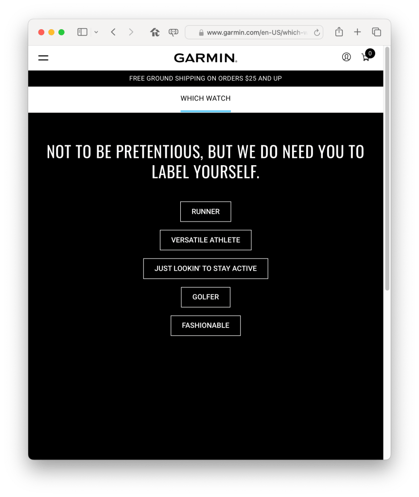
Recently I got mad at my watch, or more specifically its phone app. I have a Garmin Fenix Sapphire 7 Solar. As you might guess from that string of syllables, Garmin’s got a lot of watch models. If I’m parsing that page correctly, they’ve segmented their market across 19 brands, and just over 100 models. If you want to train for ultramarathons or Ironmans, you’d probably get a higher end watch than I did. If you just want to be healthy, there’s lots of lower end watches, focused on swimming or hiking or not-looking-like-sports-equipment. Of course there’s a wizard to help you navigate this bewildering set of choices, and of course it starts with questions about your goals.
All of the watches use the Garmin Connect app, and that app collects data from the watch about your physical activity. There is no reason to install the app if you don’t have a watch; all the app is for is getting the data off the watch and communicating to you (and Garmin, natch) about it.
In other words, there is no need for the app to ask the user this question after it self-upgraded:
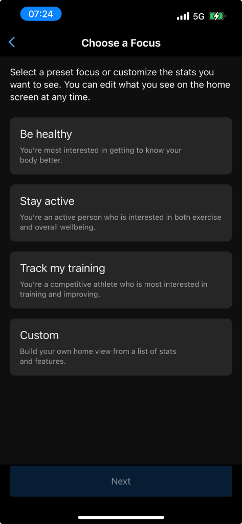
You can’t ignore this question. The app won’t start (new install) or start functioning again (post upgrade) until you make a choice. Why is this a useless question? Several reasons:
- First, people are not product marketing personas; I want to be healthy and stay active, not one or the other, and while I’m not training for a race right now I might want to soon. Am I ruling out race training if I click one of the other three buttons? Seems highly unlikely. So it stands to reason this question is just for setting a default, which can be changed later. In other words, no one in Garmin was able to decide what the default Home Screen should look like. We can only imagine a series of meetings ending with someone saying “screw it, just ask the user.”
- Okay, that’s kind of terrible, but let’s roll with it, I just want to go for a run after all. But again, we have to ask, why does the user get forced to look at this page and answer this question? Even if it’s a brand new Garmin user, why must the app ask them what they want? Remember, the app is useless unless it’s paired with a watch, and the watches are segmented across 20 brands and 100 models. So why can’t the app take a guess at what the defaults should be based on what type of watch is being paired? It seems pretty likely to me that there’s some modeling of which watches go with which personas, so why isn’t that good enough to set app defaults with? Is the Garmin product team so unsure they’ve done it right that they have to go ask again? What happens if the data doesn’t align with expectations, do they launch the 20th brand and another six models? Seems unlikely again based on this flimsy question, but what do I know, they surely ended up with a hundred watch models somehow.
- Third issue: I’m not a new user. I’ve been wearing a Garmin for over five years, this is my second watch, and they’ve got a ton of data on me (including my current Home Screen configuration). This is a stupid screen to show me as an individual consumer after an app update, even if you think it’s a good screen for a new user. A fitness-tracking watch is a very personal, single user item; I don’t think it should be asking stupid questions about the fitness that it tracks. It’s like if your keyboard wouldn’t work until you answered a question about what you’re going to write with it.
- Fourth and final… after you make the choice, it was in fact a non-issue. The prior version of the software presented a bunch of information cards on the home screen, which you could drill into to get more data. The new version has the same set of cards, but has rearranged into two areas instead of the previous single list. In the top area (In Focus) the cards are larger and swipe sideways instead of up and down, and in the bottom area (At a Glance) the cards are smaller than before and can sit in two rows of two . All of these cards are cards that existed before, and all can still be reached through their original non-Home Screen paths. There’s no way that I see to return to the market segmentation question; but you can change which cards are included in “In Focus” and “At a Glance”. It’s not great user experience, but it’s familiar; the app is only mildly different than before, and the choice in the offensive screen isn’t even relevant.
My first reaction to this question was to try to skip past it. I was annoyed, both as a user and as a software professional. As a user, it’s offensively stupid for this thing that I wear almost all the time to be asking for more data than it already has. As a professional… my reaction was “as a product manager i want the user to do my job so I don’t have to.” The product manager’s typically doing a lot, but the important part of their entire role is to synthesize available data into an accurate and legible story of the average user’s needs, so that product is built to solve those needs. Forcing the user through unsolicited and dumb questions is offensively poor product work.
As outside observers, we have no idea what’s happening inside of these decisions and can only speculate. We can guess at dozens of stories: maybe it’s internal conflict, maybe it’s pressure to respond to market changes like the Apple Watch, but no one knows outside of Garmin. Maybe it’s just entropy catching up.
Returning to my reaction as a user: my friend and colleague Kyle Champlin helped me dig into the concern. This watch is a luxury good: it’s expensive, it’s feature-rich, and it’s focused on a clear persona (unlike the Connect App’s team, apparently). A non-luxury good interrupts the user. A luxury good does not. A non-luxury good expects the user to figure things out. A luxury good does not. A luxury good buyer has expectations in common across their luxury services: Don’t bother me, and be intelligent when I bother you. Human operators instead of IVR trees. Concierge services. Dedicated or at least seemingly dedicated account managers who know their business and yours. As a consumer luxury good, it’s important for the product to not annoy the user, and to be smartly responsive when the user wants results. I think those are super valid statements for enterprise products too, complicated by the question of whether buyer and user are the same person at all, and over time.
