

There are many charting and reporting tools to use, but in my experience there is also a struggle to build charts that effectively communicate. Since you typically need to put some reports into products and certainly need to use them internally, it’s important to build competence here. Building a general purpose reporting tool is very hard, so many reporting tools make it all too easy to produce a hard to use or accidentally misleading chart. To do better, it helps to pause and think about what you want to show and what basic types of charts can do.
First, some guiding principles:
- Don’t overwhelm the chart. If you’ve got more than a dozen items going into a single chart, ask if that’s really useful and necessary. There’s a reason many charting tools default to collapsing a long tail of values into an “other” bucket. If you’ve got more than two dozen items, maybe it’s better to just show the user a data table. Look for ways to group similar data together (such as true/false indication that a problem exists), then drill to more specific results (such as details about the problem from systems with problem=true).
- Don’t overwhelm the report. Try to keep each collection of charts small enough to fit on one monitor screen. Use form inputs and drill downs to let the user select filters for subdivision. Trying to answer all questions in one report to rule them all just creates confusion.
- Use the reporting tool that’s closest to the data. Too many environments give up freshness and lose all their context by moving the data around, summarizing it, abstracting across several models, and then reporting. If you’re reporting in the data collection and storage tool, it’s much easier to pivot to “currently true” from “was true when this chart was generated”. Reporting tools should let you use drill downs to other reports to increase detail, and should provide access to raw data within three or four clicks.
There are some basic types of chart that will solve most of your report-creating needs: Line, Histogram (AKA Bar), and Pie (or Donut). Area (possibly Stacked) is a nice variation on Line, but not strictly necessary.
Pies and Donuts take a lot of heat from the data visualization community, and for pretty good reason. Let’s leave aside the subtle stuff though, there’s a couple of simple rules to follow for making sure you use them properly. Note that any time you have a Pie, a Histogram or Stacked Area could have done the job too.
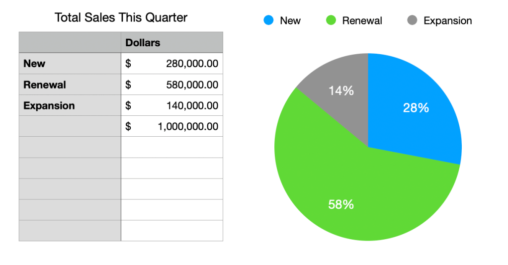
- Do you expect the things you’re measuring to add up to a complete set? In other words, if you converted your data set to percentages would you have 100%? Then you can use a pie, because you’re showing parts of a whole. For instance, maybe you’re counting the types of sales that you made this quarter: there’s a 100%, which is the total revenue, and then there are subtypes like New, Renewal, and Expansion.
- If you don’t get 100%, then don’t use a Pie. For instance, maybe you’re counting the versions of a piece of software that’s deployed in the enterprise; you can easily find 100% of the installed versions, but there’s also all the systems where it’s not installed. You could include the count of non-installed systems to make 100% if that’s the right data for the question you’re trying to answer, but if it isn’t, just move on to a Histogram.
- Do you have fewer than a dozen things to measure? Then a pie can work. Pies do not scale to large numbers of things well at all, because there’s only so many radians of a circle. You might be able to lump a bunch of long tail items into an “Other” section, but if that won’t work you should move on to Histogram.
The Histogram, or Bar chart, is a workhorse for charting. If you’ve got two dimensions of data, it’s probably the tool you want. Wait, what’s a dimension?
The fundamental act of making a chart is putting dots on a X (horizontal) and Y (vertical) plot; we then can draw bars under the dots to make a Histogram (or lines between the dots to make a Line). The dimensions of data in this fundamental chart are the X and Y numbers.
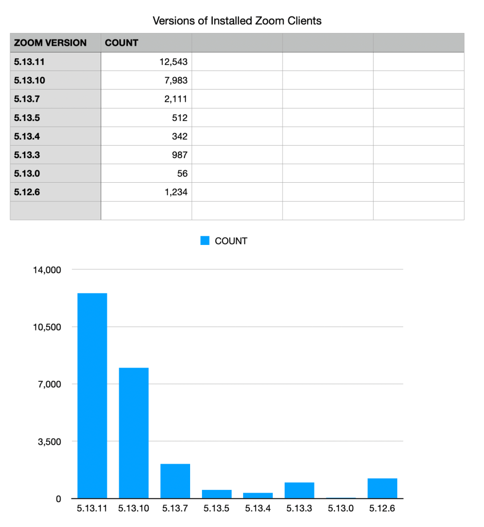
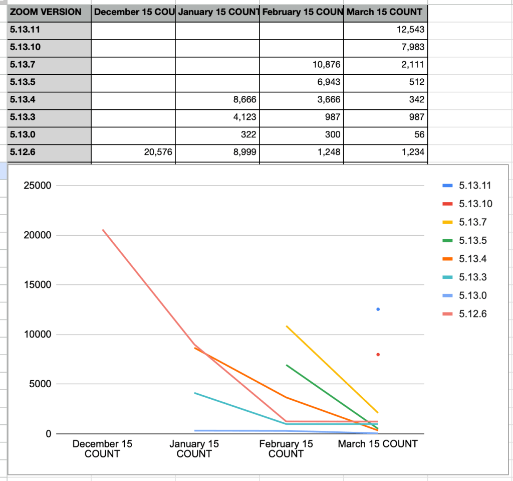
This chart increases X by one for each version of Zoom in the set, so X begins at 1 and ends at 8 (don’t be confused by the labels, semantic version numbers are not for counting with). Y is then the count of installs.
A Histogram also has the option of sorting the data, which can make things look neat and tidy.
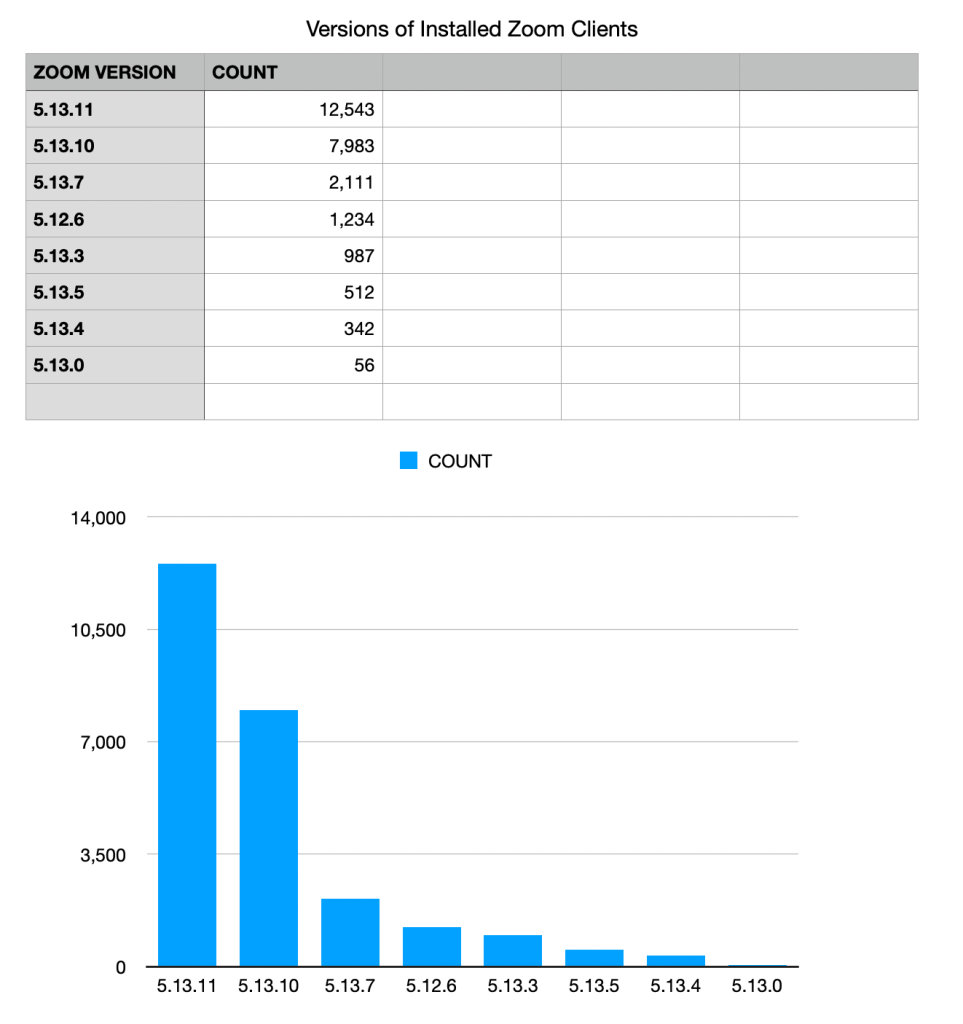
In my opinion sorting is somewhat risky — notice how much harder it is to see that a sizable number of systems are stuck on the 5.12.6 release in this sorted view.
Another tool in the Histogram is to set your Y dimension to logarithmic scale.

This scale can be non-intuitive at first, but it’s handy for bringing detail up out of the noise. If most values in a set are between 1 and 100 but you’ve got an outlier at 1000, using a log scale prevents the outlier from squashing the rest of the chart into invisibility.
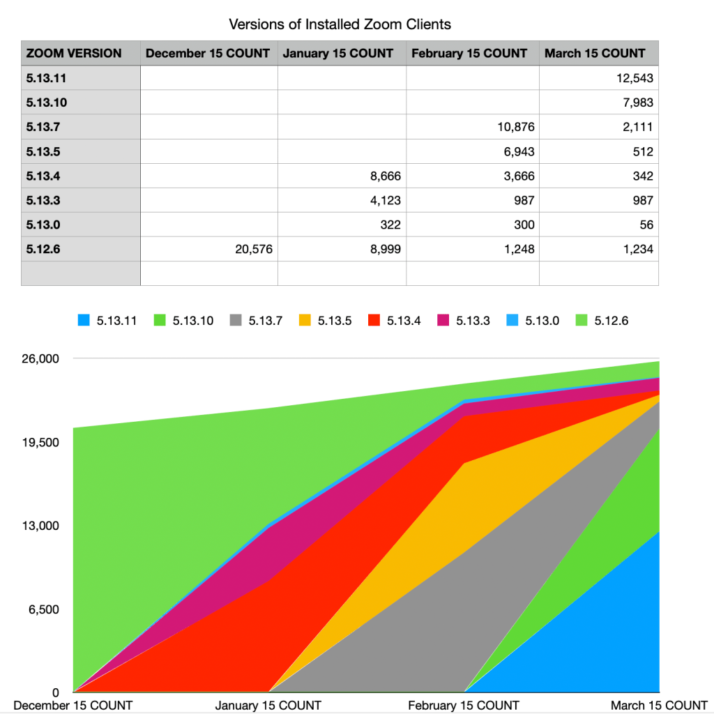
Histograms can also be turned on their side to take better advantage of a wide screen. You can cluster sets of bars together with a third data point (for instance, put all Mac Zoom clients in one set, Windows in another, and Linux in a third). You can also put more than one data point onto a bar, using stacks of color or pattern: for instance all the client versions might go into a single bar and the X dimension might be the operating system.

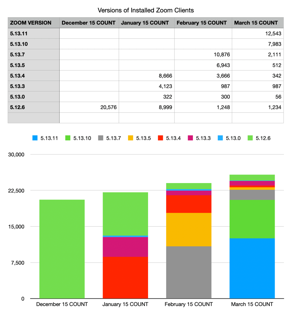
Do you need to show the data changing over time? Histograms work for that too, if you make the X dimension time.
This needs special handling by the reporting software; if your system does not know that you’re describing a date, then your dates will be out of order. Line charts can be even better for time charts, because they clearly connect each element.
I like the visual punch of an area chart for these, but it’s not always the clearest choice.
Time charts also introduce the right side problem. If you’re looking at this report on March 20th, should it include 5 days of data in a new column? What about on April 14th? Including an incomplete data set on the right side makes a false impression that the numbers are going down, while leaving the rightmost column empty can make the chart feel stale. Some charting tools might offer features to help with this choice or format the right column differently.
A second major challenge to think about in time charts is the data gap problem… a time chart often has to deal with missing data. If all the February 15 data is missing, it’s easy to represent that in a Histogram, it’s simply a missing bar. But in a Line or Area, a missing element can confuse the viewer. In a Line chart the connecting line between January and March is missing, so the viewer can get confused about which element is which. An Area chart suffers even more, because it has to slope all the areas down to zero and then back up.
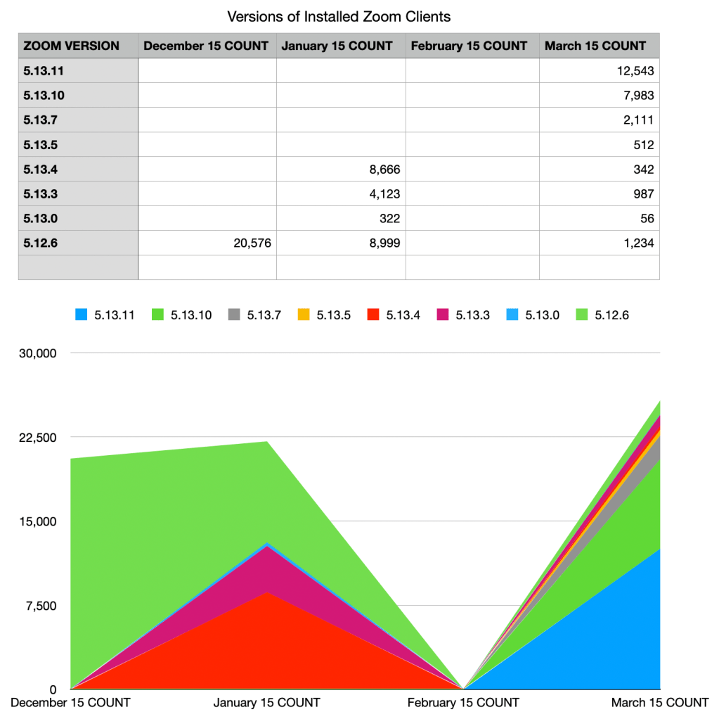
Higher quality charting products will offer an option to interpolate across segments of null data with dotted lines or faded areas.
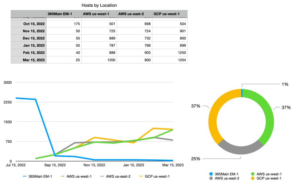
Good observability reports bring as much context with them as possible. A time chart delivers context, you can see if current values are “normal” and you can see normal shifts like weekends if the time period is long enough. However, the rightmost column is a cramped place for seeing current distribution. So, here’s a useful best practice: for a given metric, put one or more time charts on the left and a current state Histogram or Pie at the rightmost slot of the row. This is a two column example showing change over time as well as current state. It would go well with a Big Number KPI showing the total number of hosts and the trend in that number.
You may be surprised at how far those basic types will get you in building useful reports, but there are certainly use cases that require fancier solutions. If the principles above are too constraining for your data, you might need to look into a broader gallery of solutions. Here’s three that I often need.
- Choropleths are a great way to show lots of data in a familiar way, on a geographical Map. To use these, your data needs to have a column that indicates where it belongs (Latitude and Longitude columns are best, but some implementations may be able to map from a human readable region name). There’s a good reason this sort of chart in the fancy list though: they are very prone to correlation errors. A map is inherently full of information about where people live, where wealth and poverty are, where history has happened, where infrastructure is or isn’t… that might be relevant to your data visualization, or it might trick you. Map based visualizations have drawn a fair bit of well-deserved mockery in security tools as well. Pew pew! Bubble maps, Pie-on-Map, and Spike Maps attempt to get around the flaws of Choropleths, but each has the risk of obscuring data.
Flow style charts are awesome when you’re trying to show the paths through a system or relationships between entities. For instance, what are the click paths through a website? How does energy flow from production to consumption? Which ISPs are the most connected? Chords, Clusters (see Dendrogram), and Sankey charts are the tools to review. There’s three major failure modes of flow charts though: The most obvious is overwhelming the user with complexity, it’s potentially showing a huge amount of data. Also, you’re probably showing time sensitive information in a format that has no time awareness, so anomalous peaks and valleys are shown without context. Worst of all is getting the data to build this sort of chart; instrumenting systems and modeling the transactions they perform is rarely done by default and won’t be free to add later.
Tiles are a good tool when you have to show a great deal of complexity in a small report area. These can be thought of as ways to avoid the radians problem in Pie or Donut charts; instead of cramming lots of small things into slices of a pie, you cram them into squares on a bigger square. My favorite is Treemap, but you can always use something like Voronoi for more visual interest. I’d stay away from Circle Packing.
Lastly, let’s look at some very risky charting tools: Bubbles and 3D Scatterplots (or to be honest, 3D anything at all). Adding a third dimension makes for a visually dynamic report that often serves to confuse the hell out of its users. Problem number one: Ebbinghaus illusion. People are very bad at judging the relative size of circles. You might think that’s an academic concern; I’ve worked with a product that was unable to show users a classic resource leak sawtooth because the bubbles weren’t visually distinguishable. Problem number two: overlaps hide data. Problem number three: the workarounds for these Bubble problems, such as UI selectors to find the data you want, bubble translucency, and relative size sliders, add complexity to the report which make it harder to use and share. I have used Bubble charts on occasion, but I don’t like them.
What’s even worse is the 3D Scatterplot. Instead of bubbles, the third dimension is represented as an actual dimension, so you rotate a cube around to look at the data. Of course, that allows for a fourth dimension to be jammed in if you use spheres instead of points… to be honest, I only see 3D Scatterplots in trade shows, academic papers, and intern presentations. Again, extra complexity in the design and interaction make it hard to share reports, and data overlaps can hide answers.
